Friday, September 28, 2012

FD: Dining Room

As spontaneously as my technical difficulties began, they have now resolved themselves! I wish I understood what happened to make it better, but unfortunately, I'll just have to live in ignorance and hope it doesn't happen again. Without further ado, let's get to this week's installment of the First Draft tour!
Next up in the tree house apartment: the Dining Room!

Here's a shot of the dining room from the living room. It's actually pretty small - the only way this table even fits in here is with the chairs moving towards the corners.

 Here's a view of the table and the window with a little better view of the art next to the window.

 This view is from the back corner of the dining room, near the light switch, looking towards the window and the living room.
 This is the same as the first picture, except the light is turned on. The only thing I don't like about it is the shadows on the walls from the chairs. I think those shadows are coming from the natural light from the window. I might have to try taking this same photo at night.

 Here's a close-up of the art on the wall next to the window. Unfortunately, I've not come up with a way to get this shot without a reflection in the umbrella poster...

Here's a shot of the back wall, which is shared with my neighbor across the hall. This is another one where the glare is pretty terrible. 
 
 This is the wall shared with the kitchen. From the dining room, this little wall is on the left of the doorway and is closest to the living room. The frame says Norway in Scrabble letters and contains three postcards I bought while in Norway. The plate features scenes from Hastings.

 These two plates are from Pier One and the trivet is an antique I got on a trip to Duluth.

 This is the view out the dining room window down to the lawn. The cranes in the distance are still here as the road construction project continues!

Thursday, September 27, 2012

What Really Happened...

Recently, I read the book "What Really Happened" by Rielle Hunter.

For reasons I don't entirely understand, I'm fascinated by the John Edwards-Andrew Young-Rielle Hunter scandal. In case you don't remember, during the campaign prior to the 2008 presidential election, Andrew Young publicly claimed to be the father of the baby carried by Rielle Hunter, who was working as a contract videographer with the Edwards campaign. It was later revealed that the baby was actually fathered by John Edwards while his wife, Elizabeth, was undergoing cancer treatment. After the baby was born, Andrew Young wrote a book ("The Politician" - one of the best books I've ever read) about his experience working on the Edwards campaign. My understanding is that it caught the attention of the authorities, and the Department of Justice ultimately investigated John Edwards for misuse of campaign funds and prosecuted him not long ago. He was almost completely exonerated by a jury and the story sort of died out - until the release of Rielle's book!

During this election season, I can't help but encourage anyone to read about this scandal. I don't actually think that the question of paternity of little Frances Quinn is all that interesting. But, I think that what these books really show the reader is just how disconnected life in the middle of a political campaign is from "the real world." I worked on a campaign while I was in college, because I had the idea that I wanted that to be my future career path. One month of interning definitely got that out of my system! I worked 12 hours a day at an office in a city halfway across the country. Most of my colleagues were also transplants from all over the place who worked all day, until heading to the bar at night. Everyone made huge sacrifices. No one slept, most people drank, lots of people smoked, I never heard of anyone exercising, almost everyone was far from home, and the primary food groups (in addition to coffee and alcohol) were donuts, chili, and PB&Js. I feel very lucky to have had the experience of participating in a national campaign, but I certainly am not under any illusions that presidential candidates, or their staff, have much contact with reality.

The experience described by both Andrew Young and Rielle Hunter is like my experience but to the extreme. The amount of money flowing through the campaign that was used for payment of expenses is extraordinary. The hounding by the media got to the point of harassment. The lives of several other people were intimately wound up with John Edwards' life, and as is quite common in politics, he let a lot of people down when he proved to be unworthy of the hero worship that had been accorded to him.

As far as Rielle Hunter's book goes, it was just okay. The writing was nothing special and I read most of it gaping open mouthed at my Nook. She refers to the candidate as "Johnny" throughout the book, noting that that's his legal name, a factoid that most people don't know. I thought it was pretty distracting. It also seemed strange that she kept naming the restaurants where she was eating while waiting for "Johnny" to become available as she traveled the country carrying on an affair with him. I've never even heard of most of the restaurants she mentioned, and she didn't really describe the ambiance. I guess I don't get out much, and I'm not independently wealthy, so the names alone didn't help the story. She vilified Andrew and Cheri Young, as they had done to her in Andrew's book. It's not hard for me to imagine that a 40-something New Age single mother and a couple of Democratic political operatives with three kids wouldn't make ideal roommates. The strangest part of the book were her comments about how "when you're a mistress, you have to _____" with the blank filled by "wait in dark restaurants" or "hide in the bathroom while your boyfriend's assistant comes to pick up his bags." It's odd that she decided to characterize these tidbits as advice for other would-be mistresses out there, though I also thought this humanized her a little bit because it showed her adapting to her circumstances. So, although I wasn't all that impressed by her book, I think this whole story is so fascinating that I could hardly put the book down!

Tuesday, September 25, 2012

Hiatus

Hey everyone! I'm so sorry I don't have a real blog post for you today. I'm having some pretty serious technical issues. With work and other commitments, I haven't had the chance to fix them yet. I'm hoping to get the problems resolved soon. Stay tuned!

Monday, September 24, 2012

Girls Night

Girls Night

Girls Night by marvelousminnie featuring slipper shoes

For a long time, I've been hoping to plan a girls night at my apartment. I'd love to have the sleepover fun - with yummy snacks, nail polish and all the other fun things - without the necessity of actually staying over. I'm hopeful that soon I'll get my act together and you'll be seeing pictures from an actual girls night. In the meantime, we'll have to just simply enjoy this inspiration board! Hope everyone has a great week!

Friday, September 21, 2012

GCB

As you might remember, I became obsessed with the ABC television show GCB earlier this year when I decided to subscribe to HuluPlus.
This TV program cracks me up! The only bad news is that ABC decided not to renew it for another season - BOOO!!! I love that this show is kind of like "Mean Girls" (one of my favorite movies EVER!) but set in Texas and featuring adult women. I hate to admit that I think most women never really grow out of their girl-world personalities from high school. But, I really think that's part of what makes Chick Lit and Chick TV (ie Sex and the City and Lipstick Jungle) so entertaining.

Several weeks ago, I decided I wanted to read the book. I requested it from the library and it just came!

I loved everything about this book! I have to admit it was a little easier to imagine all of the book's characters after having watched the television show. However, there were quite a few significant differences between the book and the show. There were two that really stood out: in the TV show, basically all of the women are the same age. In the book, there are two different generations of women and it's interesting to watch the power dynamic between these two groups. In the book, the only one of the women who is a parent is the main character, Amanda Vaughn, played by Leslie Bibb in the TV program. So, on TV, I guess we do see two generations: one in its 40s, the other in high school. But, for the most part, in the book, the children are younger and there's much less emphasis on their social dynamic among themselves.

The book's storyline was really somewhat different than the general plot arc in the first season on TV. I was pleasantly surprised by the degree to which the book's plot hung together and told one interesting, cohesive story that had a beginning, middle and end. While the TV show's plot was interesting too, I definitely enjoyed the chance to sit down and take a little journey into the world of Hillside Park, Texas. I hope you'll consider taking a trip there too! Whether on the screen or the page, I think it will come to life and you'll enjoy it a bunch!

Thursday, September 20, 2012

Ribbon Wreath

If you spend as much time as I do reading blogs and looking at interesting things on the Internet, you've almost certainly seen a ribbon wreath project somewhere. (If you haven't, and you want to see a few that inspired me, you could look at this page or this one.) I've had the idea in mind FOR AGES that I was going to make a ribbon wreath. It took me a really long time to decide what color scheme I might like to use, especially after I made my playing card entry way decor.
Here's the finished product, along with the playing card sign!
 I was a little surprised by how much of a pain it was to make this project. There were a few times when I considered giving up, which, given my investment in the materials, would have been a big disappointment. I know there are some other bloggers who stock ribbon at home. I'm not really one of them - I have a few spools of ribbon, but definitely not enough to make a wreath like this. I decided on the color scheme to coordinate with the playing card sign and then headed off to Michaels (and later, JoAnns) to get the necessary supplies.

For me, in addition to the ribbon and the wire wreath frame, I also used fabric scissors (duh) and some Fray Block. I didn't see any other posts where the creator was concerned about fraying. But, as you can see in the photos above, there were some real issues with fraying. All of the ribbon I selected was grosgrain, which I think may be part of why fraying was an issue. It took me extra time to make the project since I was constantly cutting strips of ribbon and then needing to apply the Fray Block and let it dry before tying it onto the frame.

I was also a little surprised by just how much ribbon it took for me to cover the frame enough that it would look even moderately full. I purchased a total of 43 yards of ribbon, and I used almost all of it! The rolls of thin ribbon - in bright turquoise and lime green - were 10 yards long and I had a little bit left on each roll. If you're considering making a wreath like this, I would have to discourage the use of grosgrain-type ribbon. The ribbon is heavy enough that it won't stand up. Had that happened, I'd probably have been able to use less ribbon. I know some other people use that sheer, fluffy ribbon and I suspect that if you use that, you can use a little bit less. In any case, as much as it was annoying, I filled the frame and now it's done!!!!
 Here's a close-up of the finished product. I'm awfully proud that it's finally done and hanging up on my doorway. Now, all I need is to invite some friends over to show it off!

Ta da!

Wednesday, September 19, 2012

FD: Living Room

Next on the First Draft tour of my apartment is the living room! This is the view when you enter the living room from the hallway.
Here's the floor plan so you can get oriented. It's definitely a weirdly-shaped room, but I'm very happy with the way the furniture is arranged!

This is the view from the dining room. It is a little strange to have an angled wall, but I think it works!

This is the corner that I initially planned to be my spot to read - before I got my new (to me) red chair! This brown faux-Eames chair has been with me since my first year of college. Before that, it was my dad's easy chair when I was a tiny little kid!


This is a view of the futon and the red chair - that's the dining room off in the distance, but you'll have to stay tuned for a better view.

Here's a little vignette view over one of the short maple bookcases. I don't think this view is going to make the cut.

Here's a close-up of the double ladder bookcases that are the focal point of the room.

I also took a few shots with the lamps turned on. Do these pictures look better?

Here's another one with the lights on. I'm surprised by how yellow the shades look - they're normally white (the one closest to the lens) or light beige (the one by the window).

I also took these two pictures (one above, one below) from the same position. The only difference is the camera angle. It seems to me like the one below makes the place look more spacious...

Here's another shot of my reading nook...

This is the bookcase alcove, where the building's corner is located. I like this one, which I took by setting the camera on the floor.

And finally, a shot backwards over the red chair towards the hallway and the apartment door. I hope you've enjoyed this step of the apartment tour!

Tuesday, September 18, 2012

World Market

When I was setting up house at my first apartment, one of my favorite shopping destinations was World Market. I sometimes picked up different kinds of "international" foods, but I mostly found art and pieces of dishware that were just a little bit different than what you might find elsewhere. I also ALWAYS had World Market on my shopping agenda around Christmas time because they have unique things like Pier One at much lower prices.

 In 2009, World Market decided to close all of its stores in Minnesota, I guess because of the flagging economy. Recently, we got some VERY good news! World Market reopened in at least two of its former spaces in Minnesota on Thursday, September 13. Woo hoo! Thankfully, I had a few free minutes after work on Thursday and I was able to make a trip to World Market to celebrate the grand reopening. Here are some of the interesting things they had for sale!

 Check out these mug sets. I'm not usually that excited about sets like these because the mugs aren't enormous enough for my coffee-guzzling tastes. I might just have to make an exception for this one that shows the Eiffel Tower. That's so COOL!

 Mmmmm - LOVE this textile collection! It might be a little hard to see from this photo, but the potholder says on one side "Keep Calm" and the other side "Bake On." I think both phrases are on the same side of the dishtowel. So cute!

 As always, they have awesome and distinctive patterns. Curtains, pillows, and an arm chair!

 I also took a wander through the bathroom accessory department. These jars don't match my style, but they are so beautiful. This photo doesn't really do them justice. If you're looking for something blue and green, this is it!

 They also have lots of unique gift wrap stuff along with greeting cards! These little felt owl baskets/bags are so precious!

 They also have this awesome selection of multi-colored take-out boxes. I'm thinking of getting some to use as packaging for pieces of jewelry, though they're not exactly the right shape. Maybe I should start making candy and distributing it in these adorable containers!

I also saw these sweet little picture frames and paperweights. Notice the Keep Calm and Carry On paper weight? Nice!

 While I waited in line, I noticed this nice big collection of statement art pieces. While I don't have a huge piece from here, hopefully I'll get one someday.

 Here it is, back to its former glory. YEAH!

 I bought a couple of things, including these yummy sweets...

 and this charming little carved elephant. I had an awesome outing to World Market and I can't wait to go back!

Monday, September 17, 2012

Abraham Lincoln, Vampire Hunter

Several weeks ago, a co-worker loaned me this book. I wasn't initially certain that I wanted to read it, but I really enjoyed the experience!

This author, Seth Grahame-Smith, apparently also wrote Pride and Prejudice and Zombies, which is a book I have not read. Either way, I would suggest that before attempting to read either one, you've just got to suspend your disbelief. I don't generally choose science fiction or fantasy-type books because I have a lot of trouble doing that. I had to take breaks from reading this one - mostly because I was sick - but that gave me a chance to make sure I wasn't being overly skeptical.

I think one of my favorite parts of this book was the degree to which the author incorporated actual historical facts. For the most part, I felt like I was really just reading a work of historical fiction, which is one of my very favorite genres. I was totally fascinated by the concept that the nation was being torn apart by the existence of slavery. For some reason, in my education so far, I'd always had the impression that slavery was not a source of significant cultural tension but rather a pretext for war.

I don't believe the fictitious premise that one reason slave owners were so excited about protecting the institution of slavery was to ensure that there would always be access to victims. However, that prospect deals with an interesting logistical issue: how do vampires eat without being caught? I agree with the author that using slaves would be a relatively simple way to avoid detection, assuming the vampire can afford to buy them.

All in all, I would recommend this book. There is a little bit of gore, both when the vampires feed and when Abe Lincoln hunts (and kills) them. While there is quite a bit of fantasy, I think it still presents some cultural aspects that ring true.

Friday, September 14, 2012

FD: Entryway and Hallway

Here's the first stop on the photo tour of my tree house apartment!

For an apartment that's really not that big, my place has a pretty substantial hallway!

Come on in!

Here's the view as soon as you step inside. I guess maybe I should straighten the rug next time...

Here's another view, showing the corner and the coat closet.

This is a view of the corner from the opposite direction.

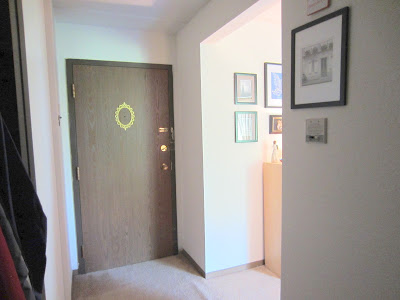
And here's the inside of the front door and the intercom!

Here's the corner with the lights turned on. I guess they're a little bit blown out, but I think they really do a lot for that piece of art.

And there's the linen closet. It's nothing special, but when you put all of these pictures together, you can get a sense of the size of the hallway. Stay tuned: the living room is up next!